Imagine walking into a jewelry store, eyes drawn to the sparkling allure of antique designs. There's an art to how colors captivate you, whispering tales of history and elegance. Colors can deeply influence our emotions and choices, which is why they're crucial in the world of antique jewelry sales.
In this journey through hues and shades, we'll explore the delicate balance between historical charm and modern-day appeal, and discover which colors best elevate the timeless beauty of vintage pieces. From the soft sheen of pastels to the commanding presence of bold tones, learn how to harness the power of color to not only catch the eye but also engage the heart.
- Understanding Color Psychology
- Selecting the Best Colors for Antique Jewelry
- Cultural Significance of Colors
- Practical Tips for Display and Packaging
Understanding Color Psychology
Delve into the realm of color psychology, and you start to uncover the subtle ways colors influence our perceptions, emotions, and actions. It's a field that explains why a vibrant ruby-red necklace may ignite feelings of passion or why a calming sapphire-blue pendant can evoke tranquility. In the sphere of antique jewelry, the notion gets expanded as colors often carry with them historical significance, adding an extra layer to their inherent allure. This transformative quality of color is not just theory; it's a recognized phenomenon that has been studied and applied across disciplines, from marketing to interior design.
The idea that color can affect mood and decision-making is supported by extensive research. For instance, red, often linked with energy and warmth, has been found to attract attention and increase the heart rate, characteristics that could drive customers' interest in statement pieces that embody passion and love. Jewelry sales experts capitalize on these associations by incorporating vibrant reds in marketing materials and retail display settings.
"Colors, like features, follow the changes of the emotions," remarked the legendary artist Pablo Picasso, emphasizing how closely intertwined our emotional being is with the colors around us.This rings especially true in choosing hues for jewelry displays, where colors like royals blues or rich emeralds might highlight exclusivity and sophistication, crafting a buying experience that feels both personal and luxurious.
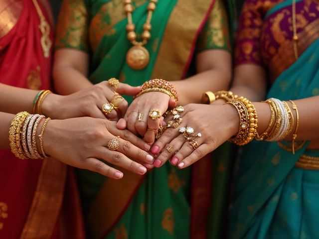
Beyond individual preferences and emotional responses, color psychology in antique jewelry also considers cultural symbolism. Colors can hold varied meanings across different societies; for instance, white represents purity and innocence in Western cultures, making it a popular choice for bridal jewelry, whereas in some Eastern cultures, the same color may convey mourning. Navigating these distinctions can help jewelers use colors effectively to appeal to a diverse clientele, acknowledging both personal and cultural lenses.
This understanding of color is not static. It’s influenced by time and trends. In the world of vintage designs, this means incorporating classic hues that speak to the era a piece originated from while also considering contemporary tastes. An emerald piece from the Art Deco period may use rich greens to suggest elegance, but pairing it with modern display elements in blacks and golds might further intrigue today's buyers. It’s about crafting an aesthetic where each color works harmoniously with the jewelry's story.
Data Insights: Evolving Trends
Examining trends over the years reveals interesting shifts in color preferences for jewelry sales. A 2022 survey revealed that blues and greens have become increasingly popular, perhaps reflecting a global shift towards environmental consciousness. The survey showed that 35% of consumers were more likely to purchase jewelry showcased against soft green backgrounds, as it signified sustainability and calmness.
| Color | Associated Emotion | Percentage of Preference |
|---|---|---|
| Blue | Calmness | 42% |
| Red | Passion | 28% |
| Green | Harmony | 30% |
The intricate dance of colors and how they are perceived is an invaluable tool in marketing antique jewelry. By harnessing color psychology, jewelers can not only enhance the visual appeal of their pieces but also forge deeper emotional connections with their audience, offering experiences that appeal not just to the eyes but to the soul.
Selecting the Best Colors for Antique Jewelry
Choosing the right colors to pair with your antique jewelry can make a significant difference in how these cherished items are perceived and adored. When considering which hues resonate best with antique jewelry, one must ponder the tones that complement rather than contrast the intricate designs and histories of these precious pieces. Each color has its own story, a narrative that merges with the sensitively crafted tales embedded in antiques. Gold, with its timeless brilliance, often highlights the intricate carvings and filigree work found in vintage brooches and lockets. This hue doesn’t overpower but rather softens, bringing out the best in these artful designs. Simultaneously, neutral tones like cream and beige can sustain focus on the jewelry itself, creating a balanced backdrop that emphasizes its details and craftsmanship.
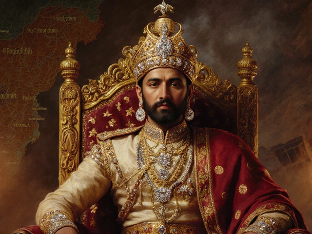
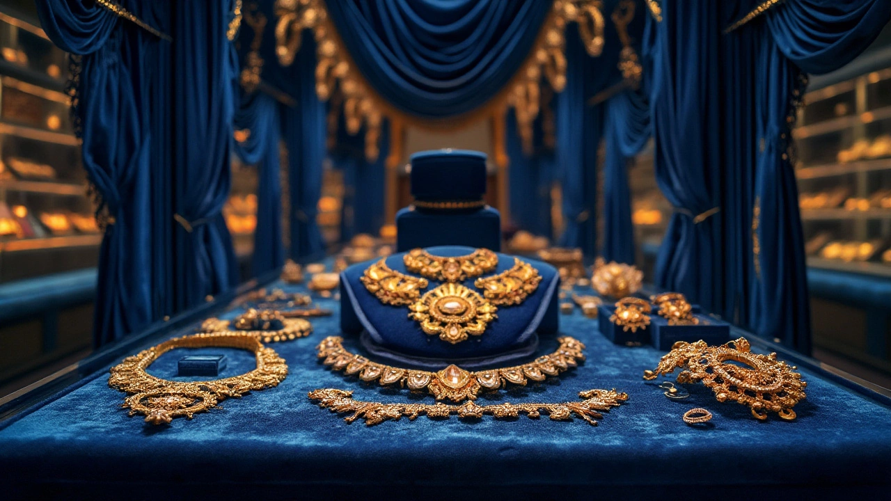
Another color that thrives when paired with vintage designs is royal blue. Known for centuries as a symbol of nobility, this rich color adds a sense of grandeur and mystery. When used in displays or as part of packaging, royal blue can elevate the aura of both gemstone rings and heirloom necklaces, intensifying their appeal. Then there's burgundy, which invokes a sense of luxury and romanticism. This deep, warm hue resonates well with Victorian and classical pieces, where the richness of the color mirrors the opulent history of bygone eras. Interestingly, the choice of colors extended beyond mere aesthetics in different cultures, making them a part of the jewelry's narrative. A table of cultural significance of colors could reveal:
| Color | Cultural Significance |
|---|---|
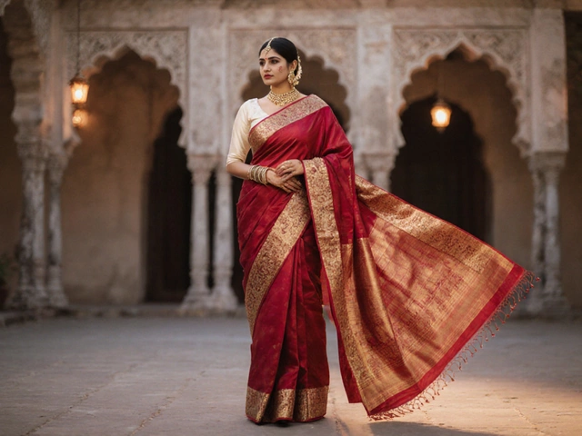
| Red | Symbol of passion and power |
| Green | Associated with vitality and wealth |
| Gold | Represents opulence and timeless beauty |
Retailers looking to sell antique jewelry should not overlook the psychology of colors in consumer environments. Studies suggest that different hues can evoke specific emotional responses, influencing buying decisions. For instance, green, often linked to tranquility and prosperity, could be effectively used to appeal to customers seeking to invest in more exclusive, serene pieces. Similarly, purple signifies nobility and ambition, sometimes creating a yearning for splendor associated with historical epochs.
A noted expert in the field once said, "Color is a power which directly influences the soul." This statement encapsulates the profound impact that thoughtful color choices can have on showcasing vintage designs.Blending these colors correctly can make a jeweler's collection cohesive and more alluring while subtly conveying the allure of treasured history through a visual palette. Harnessing the power of these hues, dealers can slightly guide the customer's journey through the rich artistry and sentimental worth of antique pieces.
Cultural Significance of Colors
The role colors play in different cultures is as varied and complex as the cultures themselves. Each hue carries its own set of meanings and emotions depending on where you are in the world. When it comes to antique jewelry, these associations can significantly impact a piece's desirability and perceived value. For instance, in many Western cultures, the color white is often linked to purity and innocence, making it a popular choice for wedding jewelry. This perception can enhance the appeal of vintage beads or pearls crafted in this shade, allowing them to find a special place in bridal collections.
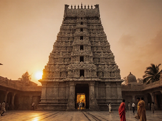
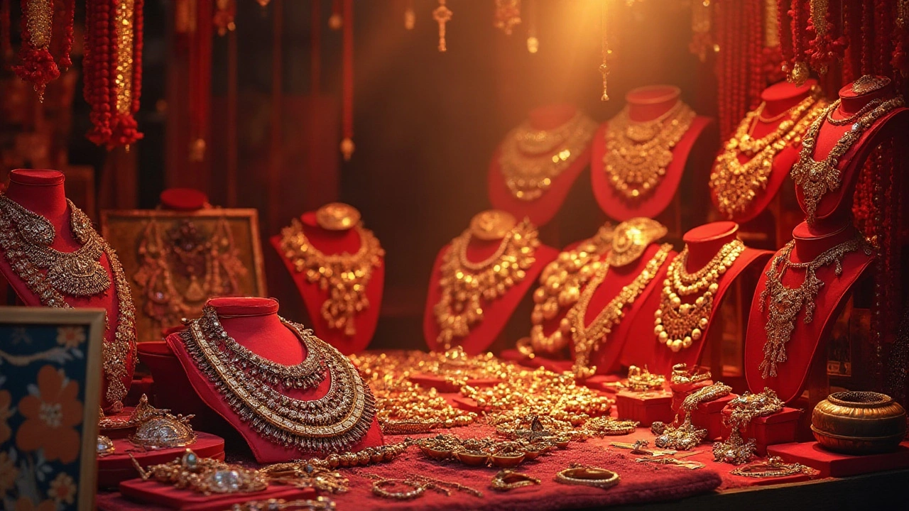
Across Asia, red is cherished as a symbol of luck, happiness, and prosperity. Antique jewelry featuring red gemstones like rubies or garnets can therefore hold particular allure in regions where such cultural associations remain strong. Chinese culture, in particular, assigns red as a festive color, used in celebrations like weddings and the New Year. Thus, owning a piece of history enshrined in red not only means wearing beauty but also donning centuries of tradition.
"Color is a power which directly influences the soul." – Wassily KandinskyMoreover, in Indian culture, yellow is linked to festivals and is considered sacred. It represents knowledge and learning, adorned by many during auspicious occasions like the harvest festival Pongal, thereby influencing jewelry choices when people seek pieces that align with these themes.
In African traditions, colors hold distinct spiritual meanings. Blue, for example, is often associated with healing and harmony. Antique jewelry featuring blue stones or accents can evoke these feelings, offering more than just visual appeal but also a deep sense of cultural spirituality. Similarly, black often represents strength and power, which can be significant in the design of older jewelry where such colors feature prominently.
To many Native American tribes, turquoise symbolizes happiness and health. It is a stone deeply embedded with ancestral history, making antique pieces set with turquoise highly valued. This cultural reverence enhances the emotional connection and authenticity of these antique jewelry items for both collectors and casual buyers. Understanding these cultural contexts can provide insight into not only the aesthetic appeal but also the intrinsic value attributed to specific colors within antique jewelry design. Retailers and enthusiasts alike can benefit from this knowledge, as it allows them to present these precious artifacts in ways that respect and honor their cultural significance. This understanding fosters a richer appreciation of the jewelry and the stories they carry through time.
Practical Tips for Display and Packaging
Displaying and packaging antiquated antique jewelry is an art form in itself, where the subtle play of colors can transform a mere showcase into a captivating narrative. The first rule of thumb is acknowledging that no two pieces of jewelry are identical, especially when it comes to vintage items, each bearing its own history and aura. Thus, allowing each piece to stand out requires thoughtful selection of display settings that complement their inherent charm.
To enhance the allure of vintage designs, consider using colors that contrast with the jewelry to make them pop visually. For example, dark-hued velvets such as deep blue or maroon can provide a luxurious backdrop for gold and diamond pieces, allowing their brilliance to shine unchallenged. On the other hand, soft pastel colors like mint or blush are perfect for silver or pearl jewelry, creating an understated elegance that whispers of nostalgia and grace. It's not just about contrast; sometimes, matching ambient colors can evoke a specific historical era, lending authenticity and depth to the pieces showcased.
In the realm of packaging, the box or pouch in which a piece is presented can speak volumes before the customer even lays eyes on the jewelry. Using eco-friendly materials not only aligns with modern sensibilities but also enhances the perceived value of the piece. Think recycled paper in soft tones, or perhaps burlap with delicate lace trimmings for a vintage touch. Adding a splash of color, such as a ribbon in a bold red or royal purple, can transform simple packaging into something extraordinary. A staggering 40% of customers admit that unique packaging influences their purchasing decision, underscoring its importance.
Lighting plays a critical role in jewelry sales, as highlighted by experts who frequently emphasize its potential to elevate the viewing experience. Incorporating adjustable LED lighting that mimics natural daylight can bring out gemstone hues and precious metal lusters without casting harsh shadows. Display cases with mirrored backings or strategic spotlights can further enhance the display, ensuring that each ray captures and reflects the intricacies of antique craftsmanship.
An old adage from the jewelry industry advises, "Good lighting doesn't just reveal beauty; it multiplies it." Whether it’s illuminating a sparkling diamond or the delicate engravings on a vintage brooch, light begets allure.
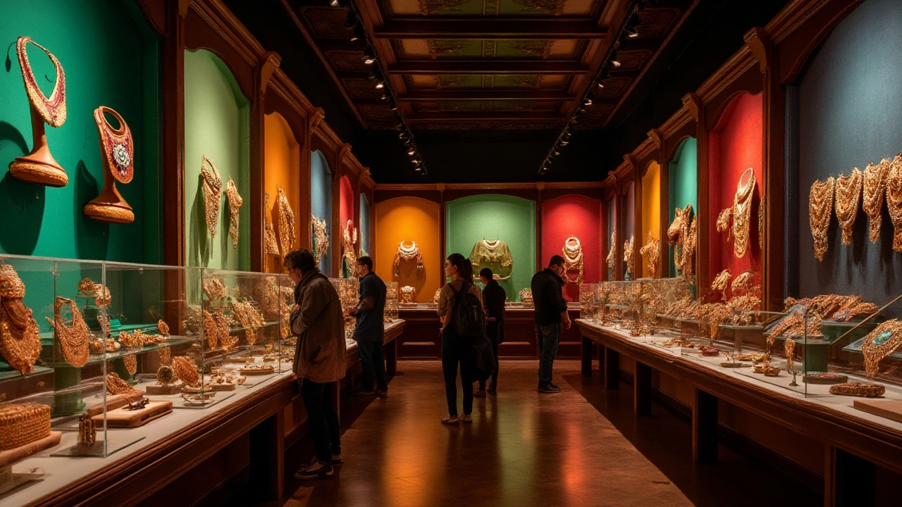
Finally, creating window displays that tell a story, perhaps by showcasing a set from a particular royal era or drawing inspiration from Art Deco design trends, can engage customers' imaginations. The use of thematic elements, such as period props or seasonal decorations, draws passersby into the narrative, encouraging them to explore beyond the glass. It’s akin to painting a picture where the antique jewelry becomes the heart of the artwork, urging viewers to not just see but feel its history and craftsmanship.