Ever struggled to find the perfect color to display your gold jewelry? You’re not alone. It’s a bit like picking the right shirt to go with your favorite tie. The color you choose can either make your gold pieces shine like the sun or leave them looking a little bland. Picking the right color isn’t merely about aesthetics; it’s almost a science.
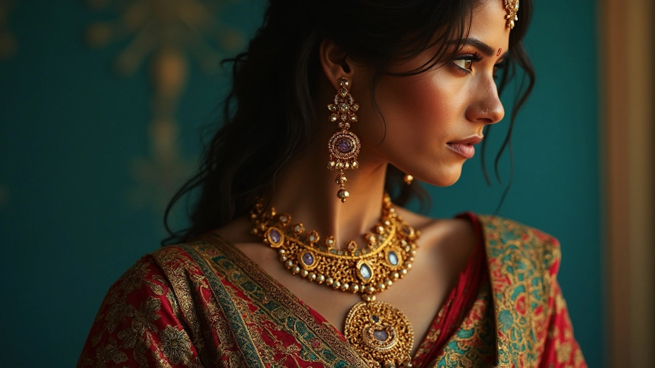
Dark tones like deep blues and rich purples are classic choices. They create a stark contrast that lets the gold pop. But don’t feel boxed into these; even trendy pastel shades can work wonders by softening the gold's look, offering a modern twist.
It’s all about balance. Imagine the thrill when you see your gold earrings glowing against a midnight blue fabric. Or the surprise when they stand out against a soft minty green background. But steer clear of pale yellows or beiges; they can make gold look washed out.
Whether it's a display window or your closet, the right backdrop can elevate your gold jewelry collection to new heights. Stick around to dive deeper into the colors that will do the trick and those better left alone.
- The Basics of Gold's Radiance
- Dark Tones: Classic Choices
- Unexpected Color Allies
- Avoiding Dull Displays
The Basics of Gold's Radiance
So, what actually makes gold jewelry stand out? Well, there’s a reason why **gold jewelry** has been a thing for centuries. It's all about that natural luster. Gold reflects light in a way that's both subtle and dazzling, depending on how it's lit and where it's placed.
Now, let’s break down the magic. Gold is a great reflector of infrared radiation, which means it retains its warmth and glow even under minimal light. This is why the right display color can make a huge difference. A slight tweak in background color can boost this luster, turning your jewelry from nice to jaw-dropping.
Gold’s Natural Hue
Another thing to know is how gold’s hue plays into its shine. Pure gold boasts a beautiful warm yellow tone. But you rarely see 24-karat gold in jewelry because it’s too soft. The bling you wear is usually mixed with other metals, creating alloys. These blends alter its appearance, leaning towards white, rose, or even greenish hues.
The Basics of Light Interaction
It's pretty cool that even small amounts of light can make gold glow. When light hits gold jewelry, it reflects back into the room and that's the trick. Whether you’re using natural sunlight or artificial lighting, you want these reflections to bounce off the piece and catch someone’s eye.
So, what next? Think about where you’re planning to show off your gold. Is it getting direct sunlight or tucked in a shadowy nook? This will guide your choice of background colors, ensuring you capture gold’s sparkle in its full glory.
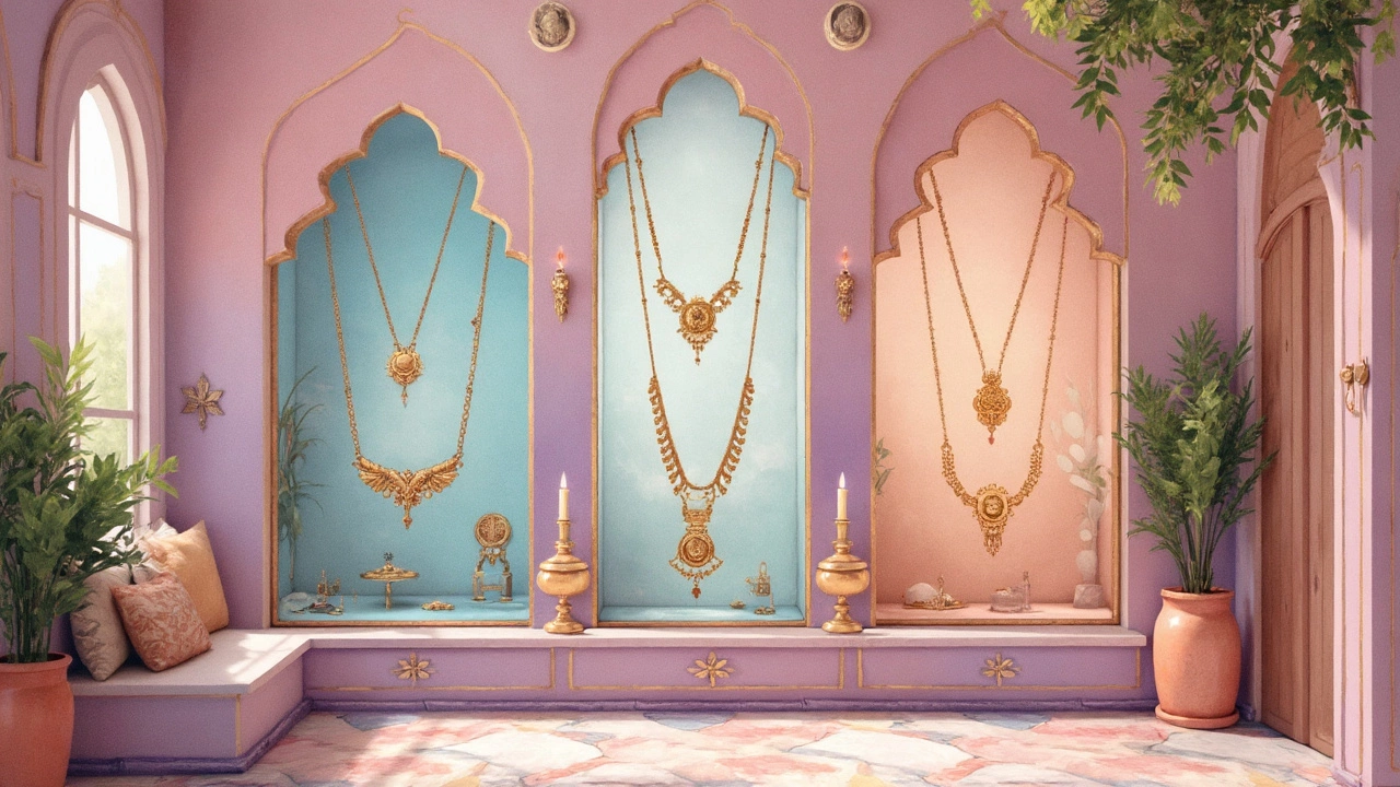
Dark Tones: Classic Choices
When it comes to making your gold jewelry dazzle, dark tones are often the unsung heroes. Think about it: there's a reason jewelers love using dark velvet boxes for glam presentations. These shades are not just about elegance; they're super effective in highlighting the natural glow of gold. It’s like turning on the spotlight but without the fuss.
Deep blues and blacks are the go-to colors. They’re perfect because they create sharp contrast, making the gold stand out like a rock star at a concert. A rich navy blue, almost like the midnight sky, can frame a piece beautifully, ensuring it gets all the attention it deserves.
Why Dark Tones Work
It’s simple. Dark backgrounds absorb extra light, leaving room for the gold itself to shine brighter. This contrast enhances every intricate detail in your piece, from subtle engravings to bold structures. We’re talking about maximum impact with minimal effort.
- Deep Blue: A consistent favorite for displaying smaller pieces like rings or earrings. The color hints at luxury and subtly highlights gold's unique luster.
- Black: The universal classic. Perfect for any showcase. It's versatile, timeless, and never fails to impress.
- Dark Green: An underrated option that’s gaining popularity. It complements gold's warm tones without overshadowing its sparkle.
According to a survey conducted by Display Masters in 2023, about 65% of jewelers reported increased sales when using dark displays in their store presentations. Clearly, this isn't just theory—it works!
So, next time you're wondering how to show off your gold, consider swapping lighter shades out for these tried-and-true dark tones. You might just find it makes all the difference.
Unexpected Color Allies
When it comes to showing off your gold jewelry, not all color choices are obvious. Sometimes, it’s the unexpected combos that steal the spotlight. Take pastels, for instance. Soft pinks or mint greens can lend a fresh, modern look while still letting your gold pieces gleam beautifully.
Ever thought about using grey? It might sound dull at first, but a soft, charcoal grey fabric can be a surprising winner. It provides a neutral backdrop that makes gold appear even more polished without any extra effort.
Pastels: A New Era
If you’re going for a softer look, pastel colors can offer a unique charm. Pale blue or lilac can create a dreamy effect, making your gold stand out without being overpowering. It’s perfect for settings where you want to keep things elegant yet approachable.
Earthy Tones
Who knew earthy shades could play so nicely with gold? Dark greens and terracotta tones provide an organic feel. They’re especially fabulous if you’re going for a natural or rustic vibe. These kinds of shades make the gold look rich and inviting.
Metallic Sparks
Want to play it a bit more daring? Try pairing your gold with other metallic colors. A hint of silver or bronze can add depth and create an intriguing contrast. Just remember, it’s about balance. Keep it subtle enough so that your gold remains the star of the show.
Here’s a simple trick for finding the right unusual background: sit your jewelry on different color swatches and see which one makes it pop. You might be surprised at which color ends up being your go-to! And whatever you do, trust your instincts—sometimes the best choices come from taking chances.
| Color | Effect on Gold Jewelry |
|---|---|
| Pastel Pink | Soft, modern glow |
| Charcoal Grey | Makes gold appear polished |
| Terracotta | Warm, earthy vibe |
Avoiding Dull Displays
Ever set out your gold jewelry only to find it looks, well, blah? It might not be the jewelry; it could be how you're showing it off. Finding the best backdrop is crucial. So let's break down some common mistakes and what you should avoid.
Steer Clear of Matching Hues
It's tempting to pair gold with yellows or beiges, thinking it's a safe bet. But that’s a trap! These similar shades actually flatten the vibrancy of gold, making it blend in rather than stand out. Your golden necklaces or earrings deserve a stage where they can shine—literally!
Avoid Patterns That Overload
While bold patterns might seem stylish, they can distract and make your stunning jewelry design get lost. When in doubt, go simple. Solid colors help your pieces catch the light best.
Lighting Matters, Big Time
It's not just about colors; lighting plays a massive role too. Harsh fluorescent lights can wash out gold’s natural glow. Opt for softer lighting—this gives your gold a warm, inviting aura.
Don’t Crowd Your Display
A neat, organized display is often more appealing than a cluttered one. A crowded setup can make your collection appear less luxurious. Give your gold pieces some breathing room. This not only highlights individual items but also gives off a chic, clean vibe.
Next time you're setting up a display for your treasured gold jewelry, remember that it's about creating the right mood. Choose dark or contrasting backgrounds, avoid overwhelming patterns, and keep it lit right. Like any piece of art, presentation can make or break how it's perceived.