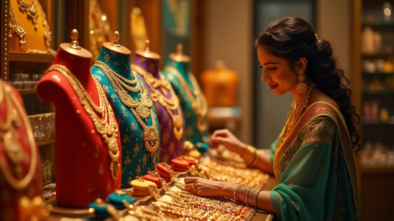
Color coordination plays an essential role in fashion, especially when it comes to accessorizing with gold jewelry. The brilliance of gold can either be enhanced or overshadowed, depending on the hues it is paired with. Most of us know the striking allure of well-chosen combinations, but awareness of what to avoid is equally important. Making thoughtful choices can pave the way for a more cohesive and stylish appearance.
Gold jewelry has a timeless elegance that deserves thoughtful pairing. However, some color combinations miss the mark when it comes to showcasing gold's unique charm. Understanding why certain hues don't match well with gold can be the difference between a standout piece and an overshadowed accessory. Knowledge of these clashes will help ensure your look is consistently polished.
- Understanding Color Clashes with Gold Jewelry
- Colors to Avoid: Common Mistakes
- Complementary Colors for Gold Jewelry
- Styling Tips for Balanced Outfits
- Enhancing Gold Jewelry with Thoughtful Pairing
Understanding Color Clashes with Gold Jewelry
When it comes to fashion, the interplay of colors can make or break your outfit. Gold jewelry, with its lustrous and ever-captivating allure, holds a special place in the world of accessorizing. However, choosing which colors to pair it with requires a bit of knowledge—and a discerning eye. First, let's understand why certain colors clash with gold jewelry. Gold's warm and radiant tones dance beautifully in sunlight, yet they risk being overshadowed by colors bearing similar warmth and depth. For instance, pairing gold with earthy browns or certain shades of orange can dull gold's shine, blending instead of highlighting it.
Color theory tells us that colors opposite each other on the color wheel, or those with high contrast, often look good together. However, when it comes to fashion tips, the key isn't just about opposites but also about balance. A common fashion faux pas is pairing gold with bold, oversaturated colors like bright yellows. While at first glance it might seem like a harmonious match—because they share similar warm tones—it can lead to an overwhelming look that lacks the desired elegance. Such bold matches can often end up appearing too one-dimensional or even clash, detracting from both the wearer and the jewelry itself.
Interestingly, an important factor to consider is lighting. Under artificial lighting, certain colors perceived as a good match with gold in daylight can clash terribly. This is because artificial light can cast different hues, highlighting undertones you might have missed initially. A tip is to check your ensemble under different lighting conditions before stepping out. As renowned fashion consultant Maria Green notes,
"Lighting can completely alter the color dynamics you're working with, especially with gold jewelry. A quick check under natural and artificial lighting can save you from a potential clash."Her insight underscores a simple yet effective strategy—evaluate your choices in varied ambient settings before making them official.
Beyond these color concerns lies an opportunity to make more informed decisions. Knowing what doesn't work can often guide you better than knowing what does, sometimes opening avenues for creative but harmonious experimentation. It's about finding a middle ground where your jewelry neither competes with nor is overshadowed by your attire. Similarly, understanding that gold itself varies in tone—from the rosy glow of rose gold to the muted shine of white gold—can also help in avoiding clashing matches. Each type of gold brings with it a unique palette of potential pairings, each worth exploring. So, if you want each piece of jewelry to narrate its own story within your ensemble, pay close attention to these dynamics.
Colors to Avoid: Common Mistakes
In the realm of fashion, finding the right color combinations can be as challenging as it is rewarding. When it comes to pairing outfits with gold jewelry, some colors may not always harmonize well. One of the most common culprits is silver. While the mixture of gold and silver has its fans, it often leads to a muddled aesthetic that can detract from the prestige of the gold piece. This is because silver reflects a cooler tone, which can clash with the warm glow of gold, making it difficult to create a cohesive visual narrative. Mixing these metals could work if you have a plan, like featuring both in significant portions within the same piece or outfit.
Another color to be wary of is neon. As attention-grabbing as neon hues are, they tend to overshadow the subtle elegance of gold. They carry a loudness that can eclipse finer details, detracting from the intricate designs of gold jewelry. Neon pinks, yellows, or greens can overwhelm the golden tones, so it's a match to approach with caution. The bold and the refined often make awkward dance partners, creating transitions that are too abrupt and aggressive for most settings. If you do decide to play with neon colors, consider using them in small, controlled accents, keeping the focus on the gold.
Let's also not forget the challenges posed by pastels, particularly pale blues and greens. These soft hues are calm and nurturing, but they risk washing out next to gold's brightness. When paired with gold, pastels can make the metal appear too glaring or flashy. It's like seeing two shades compete for the spotlight when sharing the attention might serve your style better. The subtlety of pastels can only enhance gold's beauty if the two are thoughtfully integrated, ideally with a mediator color that bridges the gap between their contrasting intensities.
I recall an interview with fashion icon Iris Apfel, where she remarked, "Personal style is about taking a risk, and the rewards often lie within sensible boundaries."
Her wisdom suggests that while experimentation is essential, knowing the limits is equally crucial to perfecting a look that speaks volumes without raising its voice.Her insights are a valuable reminder to assess risks with a guiding hand of informed decisions, a lesson worth embracing in color coordination efforts.
Complementary Colors for Gold Jewelry
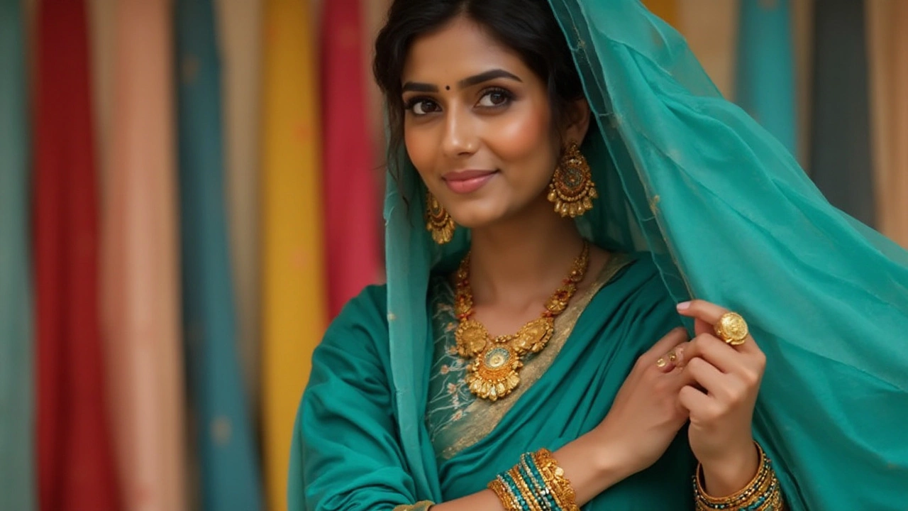
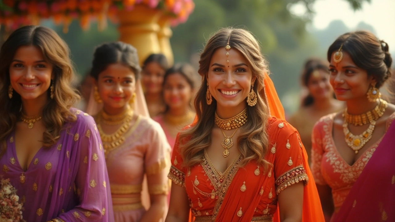
When choosing gold jewelry as a centerpiece for your ensemble, selecting the right complementary colors can amplify its innate allure, placing the spotlight where you desire it most. The warmth of gold is best accentuated by colors that both contrast and harmonize with its golden glow, bringing out the richness and glamour of each piece. Deep, regal hues such as royal blue, forest green, and rich burgundy are especially effective. These tones not only highlight the inherent luxury of gold but also provide a contrasting backdrop that makes the jewelry appear more vibrant and eye-catching.
Historically, blue and gold have been a match made in heaven, harking back to classic designs seen in ancient Egyptian and Byzantine jewelry. This timeless combination works well for both everyday elegance and evening sophistication. As fashion stylist , Alexa Chung once remarked, “The depth of blue coupled with the lustrous warmth of gold jewelry makes for an unforgettable pairing.” It's this interplay of hues that allows gold to shine without overwhelming the outfit, creating visual interest and balance.
But blue is not the only color that works wonders with gold. Earthy tones, such as burnt orange and mustard yellow, also complement gold beautifully. These shades echo the warmth of gold, resulting in a cohesive look that is both striking and subtle. When styling your outfit, consider textures as well. A soft, green velvet or a silk blouse in mustard can add an extra layer of sophistication to your ensemble, creating a tactile experience alongside the visual one.
While selecting colors might feel empowering, the science behind color theory is equally fascinating. The color wheel, a tool used by artists and designers alike, illustrates how color families work together. Gold's warmth on this spectrum benefits from the coolness of the opposite colors, adding depth and dimension to the visual palette. The interplay of complementary colors is not just pleasing to the eye but can also provoke emotional responses, heightening the impact of the jewelry. This dynamic interaction between color and emotion has been a subject of study in various fields, including marketing and interior design. Imagine the impression you can make by choosing the perfect hues.
In fashion, there's a fine line between balance and overstatement. When pairing your gold jewelry with clothing, always keep the rule of proportion in mind. If your jewelry pieces are bold, opt for more muted colors in your garments, allowing the jewelry to be the star of the show. Conversely, if the pieces are delicate, don't be afraid to introduce bolder color accents to add layers to your outfit. By understanding color theory and experimenting with hues that complement rather than overpower, you can ensure your gold pieces dazzle. After all, fashion is not merely about what you wear but how it makes you feel, empowering you to express your unique style with confidence and flair.
Styling Tips for Balanced Outfits
Creating a harmonious outfit when accessorizing with gold jewelry is an art that anyone can master with a few styling tips in their repertoire. The trick is to bring about balance using colors, patterns, and textures that work in concert with gold's natural luster. One guideline is to lean towards neutral or muted tones in clothing as they serve as an ideal backdrop for your bright accessories. Shades like soft whites, creams, taupes, and blacks don't compete with gold's radiance and allow it to shine as the focal point. When in doubt, starting with a simple palette gives you room to experiment with texture and form, whether it's ruffles, layers, or streamlined silks that enhance the gold without overshadowing it.
Adding contrast in a thoughtful way can also amplify your ensemble's allure. Pairing gold with deep emerald greens or rich burgundies can evoke a regal essence without overwhelming the senses. The key lies in moderating the intensity and ensuring the hues compliment rather than clash. For instance, blue is a versatile color that entrances when partnered correctly. Light blues and teals create a breezy, elegant vibe, while navy might offer a sophisticated balance. To add a layer of depth and personalization, consider using patterns sparingly. Stripes, polka dots, or florals can all add visual interest, provided they don't divert attention from the vibrancy of your gold pieces.
Here’s a tried-and-true principle from style icon Coco Chanel: Always take one thing off before you leave the house. The essence here is restraint; don’t let your outfit be overwhelmed by an abundance. Aim to be minimalist in other jewelry choices. A single statement piece, be it a glimmering necklace or a striking bracelet, can often speak louder than several smaller, competing items.
“Elegance is not about being noticed, it’s about being remembered,” fashion expert Giorgio Armani famously stated, highlighting the power of a well-coordinated outfit.
Breaking down the elements into manageable parts can greatly facilitate the styling process. A balanced outfit doesn't just happen; it requires a good understanding of the elements of design. Begin with establishing a focal point, usually your most cherished piece of gold jewelry. Once you decide on the centerpiece, build your outfit step by step around it. Choose clothing that complements but doesn't overshadow your jewelry. This approach not only simplifies decision-making but ensures that no single aspect of the outfit stands out awkwardly.
For those seeking a truly polished look, consistency in metals can unify your accessories. While mixing metals is a celebrated trend, maintaining one metal hue across all your adornments can imbue a more traditional and cohesive essence. Remember, at the heart of achieving a balanced look is making intentional choices, respecting the unique dynamics of each piece in relation to your personal style and the occasion. Regardless of trends, personal comfort and confidence remain indispensable, setting the stage for your individual style to take center stage.
Enhancing Gold Jewelry with Thoughtful Pairing
When it comes to maximizing the mesmerizing allure of gold jewelry, thoughtful pairing with compatible colors can make all the difference. Whether it’s a gilded necklace, bracelet, or earrings, the surrounding colors can either accentuate its brilliance or detract from its beauty. The key is balance and harmony, much like an artist uses complementary colors to create a masterpiece. Understanding the intricacies of the color wheel and how they relate to the glamour of gold can provide insightful guidance for those looking to make a stunning statement.
Historically, gold has been paired with rich, deep tones that highlight its lustrous hue. Jewel tones such as emerald green, deep royal blue, or ruby red are classic choices that offer a sophisticated contrast. These colors have a long-standing reputation for complementing gold, creating an opulent feel. Classic black, too, serves as a perfect backdrop, providing contrast while allowing gold accessories to stand out majestically. An elegant black dress adorned with gold jewelry is a timeless combination that effortlessly exudes class and sophistication.
Another way to ensure harmony is by incorporating earth tones such as muted browns, warm taupes, and beige. These natural colors create a subtle, effortless elegance that doesn’t overshadow the gold. This choice is ideal for casual or minimalistic looks, where the aim is to let the jewelry add a touch of golden glow without overwhelming the ensemble. Muted colors act like a soft canvas, allowing the natural warmth of gold to shine without distraction.
“Gold is the mirror of your inner self,” said Gabrielle Chanel, reflecting on the power that carefully chosen jewelry can convey about a person’s style and confidence.
Mere color pairing is not the sole factor; texture and design styles are also essential aspects to consider. Mixing various textures like satin or velvet with gold add layers and dimensions to one’s outfit. The interplay between a sleek satin gown and the ragged edges of a gold cuff bracelet creates intrigue and variety. Each layer adds a narrative element, adorning not just the body but reflecting personal taste and artistic vision.
Experimenting with contemporary color trends can also breathe fresh life into gold jewelry ensembles. Pastel hues, while unconventional, have proved to be an innovative pairing with gold, especially during spring or summer. Soft lavenders, gentle peaches, and pale pinks introduce a youthful, vibrant atmosphere. By allowing gold jewelry to take center stage, it stands out while adding a touch of sparkle to playful pastel outfits. The trick lies in carefully choosing jewels that won't overpower these soft tones, so the look remains balanced and refined.
When considering ways to enhance gold jewelry, thoughtful pairing is undeniably crucial. It’s less about sticking to rigid rules and more about letting imagination be your guide, crafting a story that embodies your sense of style. It is about trusting that the gold you choose is an extension of who you are, a reflection of your aesthetic choices, and an enhancement of your natural glow.