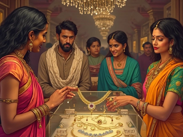
Gold stands as a timeless beacon of luxury and sophistication. Whether found in jewelry or accessories, its unyielding appeal calls for thoughtful color pairings to reveal its full grandeur. Pairing the right color with gold can make all the difference in creating a striking visual statement.
Choosing a color that complements gold involves diving a little into the world of color theory while keeping an eye on current trends. From classic tones to bolder choices, knowing which shades work best can enhance the allure of gold and ensure it dazzles in every setting.
- Understanding Gold and Color Theory
- Classic Color Pairings with Gold
- Bold and Unconventional Matches
- Tips for Selecting Colors in Jewelry Design
Understanding Gold and Color Theory
Gold isn't just an element on the periodic table; it's a symbol of opulence and warmth, cherished across cultures and eras. The captivating shimmer of gold jewelry appeals universally, and the charm of these pieces gets significantly amplified when coupled with colors that highlight and enhance their glow. Understanding how to pair gold with complementary colors involves diving into the basics of color theory, a domain that provides insights into how different hues interact and influence each other. For instance, colors directly opposite on the color wheel are called complementary colors and, when paired, create a harmonious and striking balance.
Gold itself is inherently warm with yellow undertones, making it a versatile player in the color wheel. Its warm hue means it effortlessly complements a variety of shades, but strategic pairing with cooler tones can yield particularly stunning results. Blue, a cool color situated opposite to yellow on the color wheel, often makes gold appear more vibrant, creating a regal and timeless combination. Delving deeper, understanding analogous colors—those placed next to each other on the color wheel—can also guide one in choosing the right match for gold, such as pairing it with rich oranges or deep reds to maintain a consistent warm harmony.
One crucial piece of wisdom from the sphere of design, attributed to expert designer Jonathan Adler, goes,
"Color is a vital part of personality, and knowing how to blend hues can transform any piece from ordinary to extraordinary."Applying this perspective to gold confirms the potential of color complements to make this precious metal pop. When designing a piece of gold jewelry, the chosen hues can either underscore its resplendence or diminish it, rendering the understanding of color pairings indispensable.
Beyond theoretical understandings, practical applications can often be seen in the runways of high fashion where gold is paired strategically according to seasonal palettes and moods. Trending colors can influence the desirability of gold pairings, with metallic detailing often given a pop through thoughtful color interactions. A useful approach for designers involves considering not only the base color that accompanies gold but also the dynamics of textures. Matte finishes and glossy surfaces interact with light differently, which can influence color perception and the overall effect of a jewelry piece.
For anyone involved in design, the key lies in creativity tempered with knowledge. Gold has been a canvas for experimentation across millennia, from intricate patterning in medieval relics to sleek modernist interpretations. By leveraging the extensive insights provided by color theory, anyone from a seasoned jewelry designer to an individual selecting a statement accessory can make informed choices. Gold accessories effortlessly invite their wearers to experiment, encouraging a play with contrasts or harmony in pursuit of visual splendor.
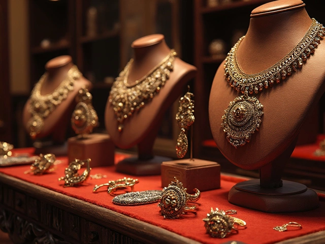
Classic Color Pairings with Gold
Gold is a versatile and timeless metal, warmly received through the ages for its unmistakable appeal and undeniable elegance. When it comes to pairing colors with gold jewelry, classic choices often bring a touch of sophistication and refinement. White is perhaps the most traditionally favored accompaniment. The crispness of white perfectly offsets the warm glow of gold, creating a contrast that is not only clean but also striking. Whether it's a white dress accentuated by a gold necklace or a white shirt paired with gold cufflinks, this combination never fails to impress. The pristine look of white allows gold to shine without distraction, ensuring the focus remains on the dazzling metal.
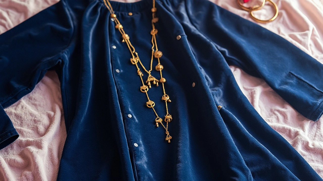
Navy blue is another universally admired choice. There's a certain timelessness to the harmony between deep blue and gold. The rich depths of navy serve as a luxurious backdrop that allows gold to truly gleam. It's a combination that feels both royal and modern. A navy gown paired with gold accessories can be an epitome of evening elegance. This duo reflects calmness and confidence. When mixed, it often reminds people of celestial themes featuring the night's sky studded with golden stars.
As style icon Coco Chanel once remarked, "Fashion is architecture: it is a matter of proportions." Blending navy with gold indeed creates a balanced architectural harmony.
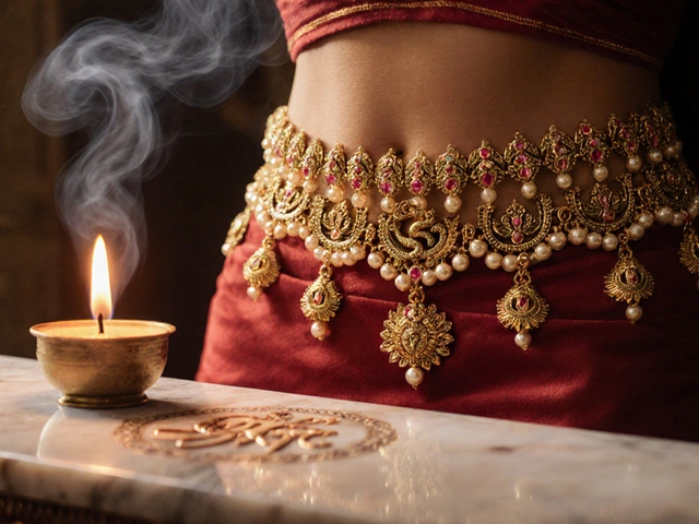
Black, on the other hand, is a bold classic that allows gold to pop with magnificence. In design and fashion alike, few combinations carry the innate power of black and gold. This pair flaunts a dramatic flair, often evoking a sense of mystery and affluence. Gold against black can stand out as a focal point with unparalleled impact, often used in partywear and gala events where making a statement is the goal. Many believe it symbolizes strength and luxury, attribute-wise highly sought after in numerous cultures and historical fashions. Black court shoes adorned with gold tips or a black satin clutch with a bold gold clasp can seamlessly elevate a look from adequate to stunning.
Let's not forget the elegance of cream and beige shades, which share a subtlety that delicately complements gold's natural charm. These variations of neutral tones can tone down gold's inherent brightness, making it suitable for a more understated yet chic appearance. The soft undertones of cream or beige offer tranquility, creating a canvas where gold can shimmer gently rather than dominate. Such subtlety is often preferred in daywear or casual surroundings where not merely vibrancy, but sophistication, is sought.
In a world where color possibilities are vast, these classic pairings with gold accessories persist as cornerstones in both traditional and contemporary design. They serve as versatile foundations from which elegance flourishes. If you are ever in doubt about how to incorporate gold into your wardrobe or designs, these timeless options offer a reliable guide. Keep this color palette close, for they enhance the natural allure of gold, emphasizing its beauty while creating a display that captures attention and admiration.

Bold and Unconventional Matches
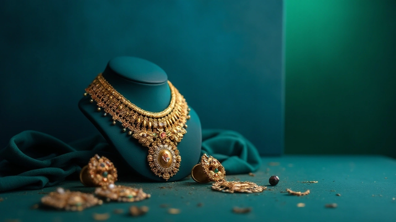
Venturing into bold and unconventional territory, we find that gold jewelry benefits from more adventurous pairings. These color combinations might not be the first that come to mind, but they can make gold stand out in fascinating ways that catch the eye. Often, it’s in the unexpected that we discover new avenues for creativity and expression. Gold, with its warm hue, can be surprisingly versatile when paired with colors like royal blue, turquoise, or even the deep green of emerald. These colors not only highlight the natural warmth of gold but also provide a vibrant backdrop that elevates its elegance.
Take, for example, the striking combination of gold and turquoise. This pair brings together the rich warmth of gold with the cool tranquility of turquoise, creating a balance that’s visually pleasing. Turquoise, known for its historical significance and cultural relevance, provides a fresh and modern touch to gold jewelry, making it an ideal choice for those looking to blend tradition with trend. In ancient Egyptian culture, turquoise was considered a symbol of protection and status, which complements the timeless nature of gold. This historical pairing brings an exotic flair to modern designs, ensuring that the wearer makes a noteworthy impression.
Another bold pairing that demands attention is gold with deep purple. This regal color combination is as old as time, often associated with royalty and power. The warmth of gold against the cool depth of purple creates a sophisticated and opulent look that feels both modern and timeless. When utilized in jewelry design, this pairing can serve as a statement piece that draws attention for its boldness. The historical precedent speaks volumes; during the Byzantine era, purple-dyed fabrics trimmed with gold embroidery were reserved for the upper class, emphasizing the weight and luxury this combination conveys even today.
“When considering color pairings for any accessory, remember the emotions and history they evoke. Gold with deep hues like purple can be both nostalgic and innovative,” explains fashion historian Dr. Emily Vailey.
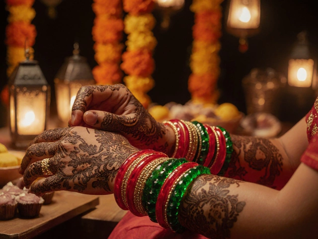
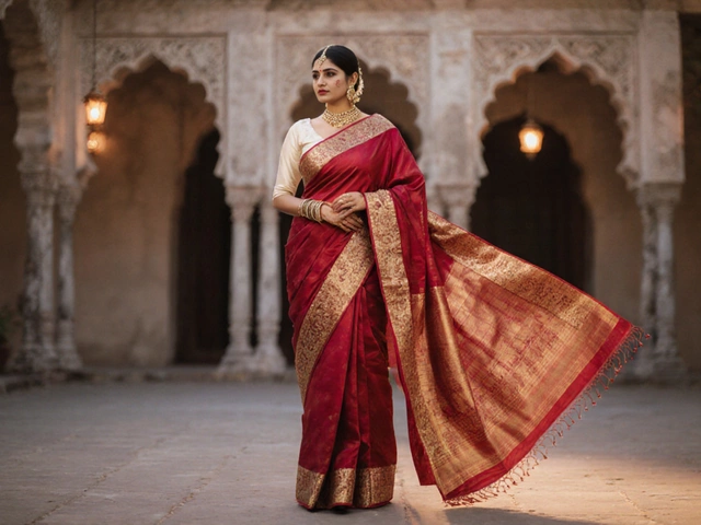
Let's not overlook the potential of red and gold, a duo that innately speaks of vibrancy and energy. This combination is particularly prominent in Asian culture, where it symbolizes prosperity and good fortune. Red lends a fiery intensity to the mellow glow of gold, ensuring that pieces designed with these tones feel dynamic and alive. When incorporated into fashion, this pairing often suggests confidence and an inherent flair for drama.
| Combination | Symbolism |
|---|---|
| Gold + Turquoise | Balance, protection, and status |
| Gold + Purple | Royalty, sophistication, opulence |
| Gold + Red | Vibrancy, energy, prosperity |
In essence, daring to explore unconventional color pairings with gold jewelry opens up new avenues of expression. These combinations are not only visually intriguing but also laden with deep cultural and emotional significance. When crafting a piece of jewelry or an outfit around these colors, you are weaving a narrative that extends beyond mere fashion, capturing attention and stirring conversation.
Tips for Selecting Colors in Jewelry Design
When designing gold jewelry, choosing the right colors to complement the metal can elevate the final product from simple elegance to breathtaking splendor. The selection process involves artistry and awareness of how colors interplay with gold's warm, inviting glow. One of the crucial tips is to consider the tone and shade of gold itself. Yellow gold, with its vivid hue, pairs magnificently with rich greens, deep purples, and classic blacks. On the other hand, white gold, with its cooler undertones, often shines best with soft pastels and icy blues. These choices can make your gold jewelry dazzle with style and personality.
Another important factor when selecting colors is to consider the meaning behind them. Colors have long been associated with different emotions and draw eyes for various reasons. For instance, pairing gold with shades of red can symbolize luxury and passion, while blue might bring a sense of calm and sophistication to your jewelry design. It's helpful to think not only about visual appeal but also about the emotional impact your design might have on the wearer.
Coco Chanel famously said, "The best color in the whole world is the one that looks good on you." This holds true in jewelry design, where personal style and preference play a significant role.Pairing different metals and stones can also make a piece stand out. While many focus solely on gold, incorporating complementary metals like silver or platinum can add intriguing contrast. Similarly, gemstones in vivid shades like emeralds, rubies, or sapphires can create eye-catching juxtapositions and add an extra layer of allure to gold settings.
Understanding lighting and occasion is another vital aspect of selecting colors in jewelry design. Different lighting conditions can drastically affect how colors are perceived, so consider the environment where the piece will be worn most often. For instance, indoor lighting may honor the muted luxury of pairing gold with earth tones, while natural sunlight will make brighter, lighter-hued stones sparkle brilliantly. Additionally, the occasion can dictate color choice; formal settings might call for subdued, classic pairings, while lively gatherings may allow for bold, playful palettes.
Lastly, current trends and customer preferences should not be overlooked. Keeping an eye on fashion trends can offer fresh ideas and inspiration for color pairings. As trends shift, so do people's tastes in jewelry. A designer who can balance timeless elegance with contemporary fashion will always appeal to a broader audience. Exploring trends doesn't mean you have to follow them to the letter, but they can provide a spark of inspiration that complements gold accessories beautifully.