Imagine slipping on your favorite gold necklace and realizing your outfit just doesn’t work. It’s like putting pineapple on pizza—sure, there’s room for debate, but some combos just grate on the eye. Gold jewelry has a classic, rich glow that almost always looks elegant, but believe it or not, it can turn sour if you pair it with the wrong colors. Wearing gold is all about harmony. When the outfit and accessories compete, you lose the sparkle—and honestly, who wants to blend into the wallpaper when you can stand out?
The Science of Color: Why Gold Stands Out
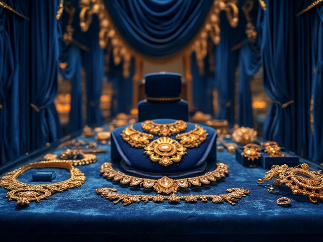
Gold isn't just another metal. It's been prized for centuries, whether as ancient coins, royal crowns, or the chunky chains on a Gen-Z influencer’s Instagram. The thing is, gold owes its warm, yellow-toned shine to the way it reflects red and yellow light while absorbing blue tones. That's exactly why certain colors clash with it. Fashion designers know this: when gold jewelry meets the wrong backdrop, it loses its punch and starts to look tacky or just dull. Knowing a bit about color science goes a long way. For example, on the color wheel, gold sits between yellow and orange. Put it next to colors that don’t share its warmth, and you’ll see the jewelry seem out of place.
The magic lies in undertones. Gold has a natural yellow-orange undertone. If you wear it with colors that have cool, bluish undertones, it often clashes. This isn’t just my opinion—stylists swear by it. My cat Whiskers, on the other hand, thinks anything matches gold as long as it comes with treats, but even Whiskers’ fur adds a warm contrast that fits well with gold.
Let’s talk facts. According to the Pantone Color Institute, color matching really affects how people perceive your style. Around 80% of first impressions are based on color alone, and when it comes to jewelry, subpar pairings can draw attention for all the wrong reasons. That means gold needs a partner, not a rival, in the color department.
The Untouchables: Colors That Never Pair Well with Gold
So, what colors just don’t play nice with gold jewelry? The biggest offenders are usually certain shades of silver, cool grays, icy blues, and some greens. Let’s break that down. Silver and gold together used to be a hard fashion “no,” and while the rules are a bit looser now, stark silver or steel gray can still make gold look dated, like you dug out grandma’s old brooch and stuck it on a space suit. It’s not just old-school thinking; it’s about how metallics interact.
Bluish hues come next. Think icy blue, navy blue, or cobalt—these make gold’s warmth look out of place. It’s a bit like dunking warm apple pie in cold soup; some will argue for the bold mix, but the clash is hard to ignore. Take a look at catwalks or red carpet events—celebs rarely, if ever, pair bold blue dresses with chunky gold. Blue works so much better with white gold or silver, and it’s not just tradition talking. Studies from FIDM (Fashion Institute of Design & Merchandising) confirm that cooler colors often overpower warm metals like gold, making them look less shiny and more “meh.”
Then you’ve got pure greens, especially the cool emerald or mint. Gold likes olive and moss, but not anything too far on the blue-green spectrum. Why’s that? It’s because green’s blue undertones don’t mesh with gold’s orangey warmth. If you want your jewelry to actually pop, steer clear of mint, teal, or aqua shades. People who wear scrubs to work know this—teal absolutely smothers gold accents, which is why hospital uniforms tend to avoid gold jewelry in dress codes.
Here’s a quick chart to help you spot the tricky combos at a glance:
| Problem Color | Clash Reason | Better Alternative |
|---|---|---|
| Silver & Cool Gray | Makes gold look dull, battles metallic tones | Beige, warm taupe |
| Icy Blue/Cobalt | Cool undertones fight gold's glow | Coral, warm red |
| Emerald/Mint Green | Blue-green shades clash with gold's warmth | Olive, mustard |
| Pastel Purple | Makes gold jewelry look brassy | Deep plum, burgundy |
Pay attention to neon colors, too. Neon pink, lime green, and electric blue just make gold jewelry look cheap. There’s no nice way to say it—they turn luxurious metallics into party favor material. If you like bold colors, go with jewel tones instead: deep reds, purples, and earthy greens work wonders.

When Mixing Works: Close Calls and Controversial Combos
There’s always that one friend who breaks the rules and looks fierce. Sometimes, cool blues or certain grays can work with gold if you know what you’re doing, but it’s risky. For example, pairing navy blue with thin, delicate gold chains can be chic, especially for evening wear. The catch? The gold has to be subtle, and the blue not too sharp. Go for matte finishes. Think of how charcoal or dark denim sets off gold without fighting it—that’s the sweet spot.
Let’s talk white. White can be amazing with gold, especially if you want the jewelry to be the centerpiece. But icy, blue-tinted whites can backfire, making gold look off-yellow instead of glowing. When in doubt, pick cream or off-white. These shades let the gold shine without drawing attention away.
Patterns are a whole different beast. If your outfit has lots of colors or busy prints, gold jewelry can get lost in the noise unless you pick out one of the pattern’s warmer tones to highlight. Think leopard print—it was made for gold. But an abstract print loaded with neon and strange blues? Probably not your best move.
Fashion houses love bending the rules, but they know when to tread carefully. Take Versace’s Resort 2024 collection: they used gold with punchy reds and sun-baked oranges, steering clear of cold, clinical blues and greens. They play with contrast but never undermine the gleam that makes gold so appealing.
If you’re feeling adventurous, try layering. Mix gold with rose gold or brass for a trendy feel, but keep silver apart unless you want a true mixed-metals statement (and you really have to own it to pull it off).
What Works Best With Gold: Winning Color Choices and Styles
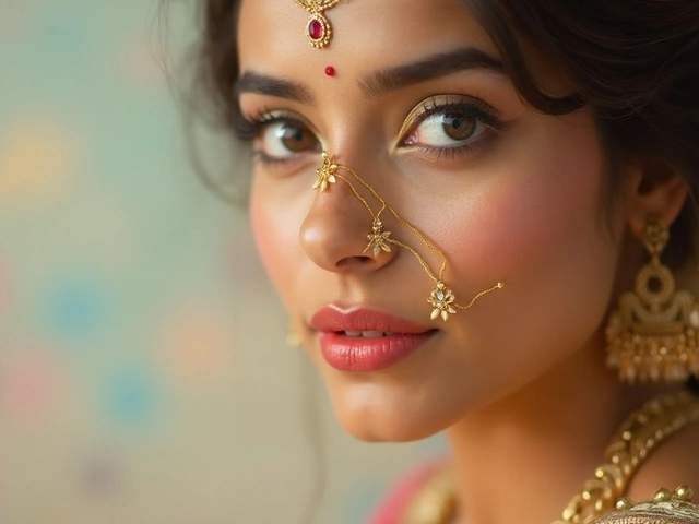
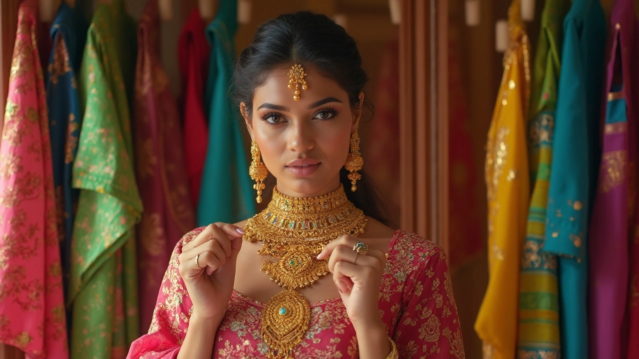
So what colors make gold jewelry look like a million bucks? The answer is in harmony and contrast, not competition. Wear gold with earthy tones like rust, burnt orange, deep burgundy, or olive green, and you’ll see the metal light up. Black is a timeless choice—think Audrey Hepburn. Simple black dress, gold earrings, instant classic.
Rich browns and tans are another match made in heaven. If you want something lighter, pastel peaches and corals are perfect partners. Why? Because they replicate the warmth of gold and reflect the same tones. Jewel colors like ruby, amethyst, and even some deep teals (closer to green than blue) complement gold nicely, while bright reds and dark oranges create a fiery, regal vibe.
It helps to think like an artist. Look at a painting from the Renaissance: you’ll see gold leaf set off by rich reds, warm browns, and ivory. These combos are no accident—they were picked for the way they add warmth and depth.
Outfit style matters, too. Gold jewelry pops with simple, unfussy clothes. Chunky gold chains and hoop earrings can glam up an all-black tracksuit or add a twist to a plain tee and jeans. The trick is balance: the more ornate the jewelry, the simpler the clothes should be, and vice versa.
- Gold + Black: Elegant, never fails
- Gold + Burnt Orange: Bold and rich
- Gold + Burgundy: Regal, dramatic
- Gold + Forest Green: Natural, earthy feel
- Gold + Warm Beige: Subtle, everyday luxury
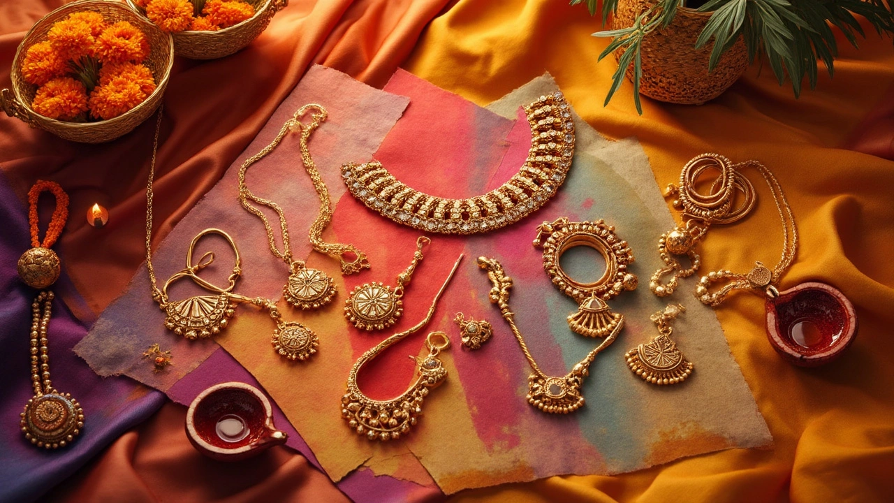
If you want to double down on the luxe look, don’t be afraid to wear multiple pieces. Layer a gold chain with small earrings or stack some rings. Just keep the rest of your look low-key. Whiskers likes to nap on my black wool sweaters, and honestly, it’s the perfect canvas for my chunky gold bracelet. Even my cat knows—keep it simple, let the gold shine.
Troubleshooting and Styling Hacks
Still not sure what goes with what? Here are some quick fixes. If you accidentally wear a color that doesn’t vibe with gold, add a belt or shoes in a warmer tone. Or, switch to a gold piece that has colored stones matching your outfit—it creates cohesion. If your look needs an extra kick, try a scarf or jacket in a more gold-friendly shade. Accessories can cover a multitude of sins.
Don’t underestimate skin tone either. Warmer complexions make gold glow. If your skin is very cool with pinkish undertones, consider rose gold, which straddles the line between silver and gold, or opt for gold mixed with other metals.
Be wary of seasonal color changes. In summer, people tend to wear lighter, brighter colors, some of which can wash out gold. If you’re going to a garden party and want to sport gold jewelry, steer clear of icy pastels or fluorescent shades. Spring’s pastels aren’t always your friend—unless you stick to those with yellow or peachy undertones.
Finally, keeping gold jewelry clean and well-polished helps it look good with just about any outfit. Tarnished or scratched gold loses its impact, making clashing colors even more apparent. So if you want to make sure your look doesn’t fall flat, keep your accessories in top shape and double-check those color combos before heading out. Style is mostly about confidence and wearing what makes you feel good, but a little color science never hurts—unless you’re Whiskers, who sleeps through every fashion disaster I make.